4.5 Monthly and annual DHW and temperature

Last updated

July 6, 2026

4.5 Monthly and annual DHW and temperature

On this page

This page turns merged daily temperatures into the monthly and annual temperature summaries and the degree-heating-week (DHW) heat-stress index used downstream in the resilience analyses. It reads the daily temperature product from the upstream merge page, applies bleaching thresholds, and derives three time-series products. The page writes three downloadable data products, each with metadata: monthly temperature, annual temperature, and weekly DHW with the annual maximum flagged. The DHW maximum-annual value is the heat-stress variable the resilience analyses draw on, and the faceted figures cover weekly DHW, maximum annual DHW, and the monthly and annual temperature series with interactive companions for cross-site comparison.

Data sources

This page reads the daily temperature product from the upstream merge page, which combines logger records from the TCRMP and VINPS monitoring programs (CSUN temperatures are borrowed from the VINPS Yawzi and Tektite loggers). Measured bleaching thresholds come from the TCRMP sites, and site depths from the site metadata are used to derive thresholds for the remaining sites and to order facets shallow to deep. The derived monthly, annual, and weekly-DHW products this page produces are available in the Downloads section below.

WarningThree programs, and CSUN temperatures are borrowed

This page combines three programs with different sampling designs. TCRMP and VINPS record temperatures at their own reef sites. CSUN does not run its own temperature loggers at every site, so CSUN temperatures are borrowed from the VINPS Yawzi and Tektite loggers in St. John. Read the CSUN temperature series as the nearest available VINPS record, not an independent CSUN measurement. Program is encoded by color in the monthly and annual figures so the three records stay visually separable. The record length differs by program (VINPS starts about 1999, CSUN as early as 1992), so a site with a short curve reflects a shorter logger record, not missing data.
The temperature averaging approach follows the CSUN dataset (see RRSdata/data_CSUN/CSUN_temperature_YawziTektite_metadata.txt). Temperatures are recorded every 15 to 30 minutes using various loggers at different depths and time periods. These readings are averaged by day, then by month, and monthly mean temperatures are used to calculate annual mean and range. 1

Daily temperature data

The page reads the most recent embargo-safe daily temperature product, so the read tracks the current cut without a hardcoded year.

Show code
tempDat <-
  read.csv(local({ f <- list.files("../../outputs", pattern = "^s4pt4_temperatureDaily_.*sites_[0-9]+_[0-9]+\\.csv$", full.names = TRUE); f[which.max(file.mtime(f))] }))  # most recent temperatureDaily output (embargo-safe; no hardcoded year)

The daily temperature file holds 240,815 site-day records across 45 sites and the three programs (CSUN, TCRMP, VINPS).

DHW and bleaching thresholds

Bleaching thresholds

The measured thresholds come from the TCRMP sites.

Show code
bleachingthresholds <-
  read.csv(
    "../../../RRSdata/data_TCRMP/xtra_originalExcelSheets_metadata/TCRMP20210302_Bleaching_Thresholds.csv"
  )

bleachingthresholds <- bleachingthresholds |> select(Location, BT)
bleachingthresholds$site <- bleachingthresholds$Location
bleachingthresholds$Location <- NULL

The threshold table carries the bleaching threshold (BT, °C) for 43 TCRMP sites, ranging 28.1 to 30 °C.

For sites without a measured threshold, the page derives one from the depth relationship in the supplementary information of Smith et al. (2016): BT = 30.03 - 0.0256*Z, where BT is the bleaching threshold (°C) and Z is the site depth (m).

Show code
# derive other BT here for:
#  [1] "BUIS-Western Spur and Groove"
#  [2] "VIIS-Haulover"               
#  [3] "VIIS-Newfound"               
#  [4] "VIIS-Yawzi"                  
#  [5] "VIIS-Mennebeck"              
#  [6] "BUIS-South Fore Reef"        
#  [7] "Europa Bay"                  
#  [8] "Neptunes Table"              
#  [9] "West Little Lameshur"        
# [10] "White Point"                 
# [11] "East Tektite"
# use depths in sitedat, and merge...

bleachingthresholds2 <-
  data.frame(
    BT = rep(0, length(
      setdiff(sitedat$site, bleachingthresholds$site)
    )),
    site = setdiff(sitedat$site, bleachingthresholds$site)
  )

bleachingthresholds2 <- bleachingthresholds2 |>
  left_join(sitedat, by = "site") |>
  select(BT, site, depth)

bleachingthresholds2$BT <- 30.03 - 0.0256 * bleachingthresholds2$depth

bleachingthresholds2$depth <- NULL

bleachingthresholds <-
  rbind(bleachingthresholds, bleachingthresholds2)

Weekly maximum temperatures

The weekly summaries first need a week index derived from the date.

Show code
# Create a Date column
tempDat$date <-
  as.Date(with(tempDat, paste(year, month, day, sep = "-")), "%Y-%m-%d")

tempDat <- tempDat[order(tempDat$date), ]
# Create a Week index column
tempDat$week_index <- ISOweek(tempDat$date)

# Show the resulting data frame
# print(data)

The next step calculates the weekly mean temperature and the weekly anomaly, the weekly value minus the maximum monthly mean (MMM = BT minus 1).

Show code
weekly_data <- tempDat |>
  group_by(program, year, site, week_index) |>
  summarise(weekly_mean_temp = mean(meantemp, na.rm = TRUE)) |>
  # summarise(weekly_max_temp = max(meantemp, na.rm = TRUE)) |> # new 1 april 25
  left_join(bleachingthresholds, by = "site") |>
  mutate(MMM = BT - 1) |>
  # mutate(weekly_anomaly = weekly_max_temp - MMM)
  mutate(weekly_anomaly = weekly_mean_temp - MMM)


# weekly_data <- tempDat |>
#   group_by(program, year, site, week_index) |>
#   # summarise(weekly_mean_temp = mean(meantemp, na.rm = TRUE)) |>
#   summarise(weekly_max_temp = max(meantemp, na.rm = TRUE)) |> # new 1 april 25
#   left_join(bleachingthresholds, by = "site") |>
#   mutate(MMM = BT - 1) |>
#   mutate(weekly_anomaly = weekly_max_temp - MMM) 
#   # mutate(weekly_anomaly = weekly_mean_temp - MMM)

weekly_data <- weekly_data |>
  filter(!is.na(weekly_anomaly))

# test example to compare to spreadsheet on 5 Sept
# weekly_data <- weekly_data[1:12,]
# weekly_data$BT <- 30
# weekly_data$MMM <- 29
# weekly_data$weekly_max_temp <- c(30.11571, 29.59571, 29.21571, 29.48429, 30.30857, 30.28286, 30.47143, 30.20286, 29.74143, 30.08143, 30.41857, 30.11714)
# weekly_data$weekly_anomaly <-
#   weekly_data$weekly_max_temp - weekly_data$MMM

DHW: 12-week rolling sum of weekly anomalies

What happens here: this computes a value equivalent to degree heating weeks (DHW) for each week. It looks back over the previous 12 weeks, adds up only weekly anomalies of 1°C or more, and requires the weeks to be consecutive (no gaps). The result is a cumulative heat-stress value, the DHW. The calculation does not carry across year boundaries, which rarely matters because DHW is seldom an issue around the new year.

Show code
weekly_data$rolling_sum <- 0

#convert week index to numeric so can arrange on it
weekly_data$week <-
  as.numeric(sapply(weekly_data$week_index, function(x) {
    as.numeric(unlist(strsplit(x, "-W"))[[2]])
  }))

weekly_data <- weekly_data |>
  group_by(site, year) |>
  arrange(week) |>  # Sort by the 'week' column
  mutate(rolling_sum = map_dbl(row_number(), ~ {
    start_idx = if (.x - 11 > 0)
      .x - 11
    else
      1
    end_idx = .x
    seq_weeks = week[start_idx:end_idx]
    is_sequential = all(diff(seq_weeks) == 1)

    if (is_sequential) {
      ind <- weekly_anomaly[start_idx:end_idx]
      if (any(ind >= 1, na.rm = TRUE))
        sum(ind[ind >= 1], na.rm = TRUE)
      else
        0
    } else {
      0
      # If weeks are not sequential,
      # set the rolling_sum to 0
    }
  })) |>
  ungroup()

Maximum annual DHW for each site

The maximum annual DHW follows the variable used in Gove et al. (2023).

The next step reshapes weekly_data for plotting and saving: it attaches depth, orders sites shallow to deep, renames the rolling sum to dhw, and flags the annual-maximum week per site.

Show code
weekly_data <- weekly_data |>
  left_join(sitedat |> select(site, depth), by = "site") |>
  select(program,
         year,
         week,
         site,
         depth,
         BT,
         weekly_mean_temp,
         # weekly_max_temp,
         rolling_sum)

weekly_data$dhw <- weekly_data$rolling_sum

weekly_data$rolling_sum <- NULL

weekly_data <-
  weekly_data[order(weekly_data$depth),]

weekly_data$site <-
  factor(weekly_data$site, levels = unique(weekly_data$site))

# weekly_data <- weekly_data |>
#   group_by(program,site,year) |>
#   mutate(annual_max = ifelse(dhw == max(dhw), 1, 0))|>
#   ungroup()

weekly_data <- weekly_data |>
  group_by(program, site, year) |>
  mutate(rank = row_number(-dhw)) |>  # rank by descending dhw
  mutate(annual_max = ifelse(rank == 1, 1, 0)) |>
  select(-rank) |>  # you can remove the rank column if you don't need it
  ungroup()

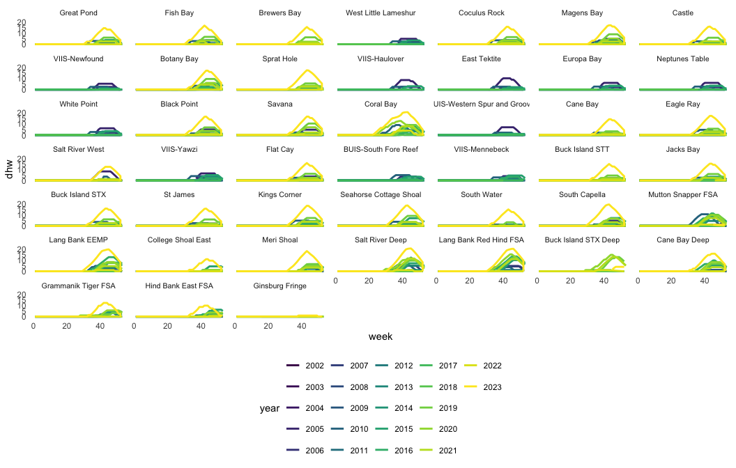
The weekly-DHW curves in Figure 1 show how heat stress builds through each year at every site. The peak of each yearly line is the maximum annual DHW, the value carried into the resilience analyses. Sites are ordered shallow to deep and years are colored on a single colorblind-safe viridis scale.

Show code
ggplot(weekly_data, aes(
  x = week,
  y = dhw,
  group = factor(year),
  col = factor(year)
)) +
  geom_line(linewidth = 1, alpha = 1) +
  facet_wrap(~ site) +
  scale_color_viridis_d(name = "year") +
  theme_minimal() +
  theme(
    strip.text = element_text(size = 8),
    legend.position = "bottom",
    legend.direction = "horizontal",
    panel.grid.major = element_blank(),
    panel.grid.minor = element_blank()
  )
Sec 4.5 Figure 1: Weekly degree heating weeks (DHW) at each site, with one line per year colored on a continuous viridis scale. The peak of each line is the maximum annual DHW used as a variable in the analyses. Sites are ordered shallow to deep. The 45-site grid is a candidate for an interactive site-picker.

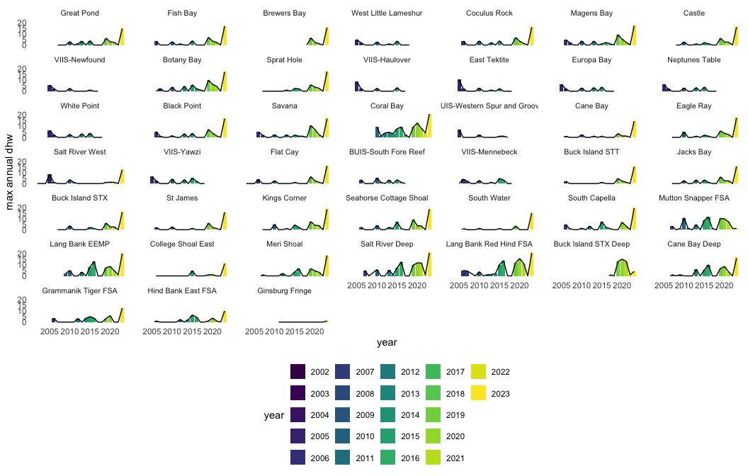
Figure 2 collapses each site to its single hottest week per year, so the reader sees the year-to-year peak heat stress that drives the resilience response. Bars and years share the same viridis scale as Figure 1.

Show code
ggplot(weekly_data |>
         filter(annual_max == 1),
       aes(
         x = year,
         y = dhw,
         group = site,
         fill = factor(year)
       )) +
  geom_bar(stat = "identity", alpha = 1) +
  geom_line(aes(x = year,
                y = dhw)) +
  facet_wrap(~ site) +
  scale_fill_viridis_d(name = "year") +
  theme_minimal() +
  theme(
    strip.text = element_text(size = 8),
    legend.position = "bottom",
    legend.direction = "horizontal",
    panel.grid.major = element_blank(),
    panel.grid.minor = element_blank()
  ) +
  ylab("max annual dhw")
Sec 4.5 Figure 2: Maximum annual DHW at each site, one bar per year on the same viridis year scale as Figure 1. Sites are ordered shallow to deep.

Monthly average, min and max temperatures

Show code
tempDat$mtemp <- tempDat$meantemp # so that can redefine meantemp...
tempDat$meantemp <- NULL

tempDat_monthly <- tempDat |>
  dplyr::group_by(program, year, month, site) |>
  dplyr::summarise(
    meantemp = mean(mtemp),
    sdtemp = sd(mtemp),
    maxtemp = max(maxtemp),
    mintemp = min(mintemp),
    nmsmts = sum(nmsmts)
  )

The site metadata is merged so the facets can be ordered shallow to deep.

Show code
tempDat_monthly <-
  merge(tempDat_monthly, sitedat, by = "site")

tempDat_monthly <-
  tempDat_monthly[order(tempDat_monthly$depth),]
tempDat_monthly$site <-
  factor(tempDat_monthly$site, levels = unique(tempDat_monthly$site))

tempDat_monthly$date <-
  lubridate::my(paste(tempDat_monthly$month, tempDat_monthly$year))

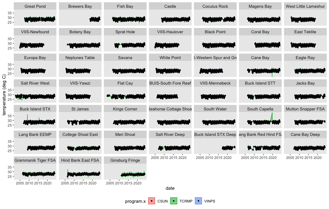
Figure 3 shows the full monthly temperature record at every site, with the ribbon spanning each month’s minimum to maximum and color marking the monitoring program. This is where the multi-program structure is visible: the three programs sit side by side, and the shorter curves are the sites with shorter logger records rather than data gaps.

Show code
ggplot(tempDat_monthly,
       aes(
         x = date,
         y = meantemp,
         color = program.x,
         fill = program.x
       )) +
  # geom_line() +
  geom_ribbon(aes(ymax = maxtemp, ymin = mintemp), alpha = 0.5) +
  geom_point(color = "black", size = 1) +
  # geom_linerange(aes(ymax= meantemp+sdtemp, ymin = meantemp-sdtemp), alpha=1,color="black", linewidth=0.5)+
  facet_wrap(~ site, nrow = 7, ncol = 7) +
  theme(legend.position = "NULL") +
  ylab("temperature (deg C)") +
  scale_y_continuous(expand = c(0, 0)) +
  geom_vline(
    xintercept = 2005,
    color = "gray50",
    alpha = 0.5,
    lty = "dashed"
  ) +
  # theme_classic() +
  theme(strip.text = element_text(size = 10)) +
  theme(legend.position = "bottom") +
  theme(panel.grid.major = element_blank(),
        panel.grid.minor = element_blank())
Sec 4.5 Figure 3: Monthly mean temperatures at each site (black points), with each month’s minimum-to-maximum range shown as a ribbon colored by monitoring program (TCRMP, VINPS, CSUN). Sites are ordered shallow to deep. CSUN temperatures are borrowed from the VINPS Yawzi and Tektite loggers. The dashed line marks the 2005 bleaching event.

The interactive companion in Figure 4 superimposes all sites in one panel, so the reader can toggle sites on and off in the legend to compare temperature records directly.

Show code
p <-
  ggplot(tempDat_monthly,
         aes(
           x = date,
           y = meantemp,
           color = site,
           fill = site
         )) +
  # geom_line() +
  geom_point() +
  ylab("temperature (deg C)") +
  scale_y_continuous(expand = c(0, 0)) +
  geom_ribbon(aes(ymax = maxtemp, ymin = mintemp), alpha = 0.2) +
  geom_vline(
    xintercept = 2005,
    color = "gray50",
    alpha = 0.5,
    lty = "dashed"
  ) +
  # theme_classic() +
  theme(strip.text = element_text(size = 10)) +
  theme(legend.position = "bottom") +
  theme(panel.grid.major = element_blank(),
        panel.grid.minor = element_blank())
# facet_wrap(~ site, nrow = 7, ncol=5) +
# theme(legend.position = "NULL")

ggplotly(p)
Sec 4.5 Figure 4: Interactive companion to Figure 3: monthly mean temperatures colored by site, with all sites superimposed in one panel. Use the legend to compare sites.

Calculate annual averages

Show code
tempDat_yearly <- tempDat |>
  dplyr::group_by(program, year, site) |>
  mutate(topdecilemean = mean(mtemp[order(-mtemp)][1:floor(0.10 * length(mtemp))])) |>
  mutate(bottomdecilemean = mean(mtemp[order(mtemp)][1:floor(0.10 * length(mtemp))])) |>
  dplyr::summarise(
    meantemp = mean(mtemp),
    sdtemp = sd(mtemp),
    maxtemp = max(maxtemp),
    mintemp = min(mintemp),
    nmsmts = sum(nmsmts),
    topdecilemean = mean(topdecilemean),
    bottomdecilemean = mean(bottomdecilemean),
    decilemeandifference = topdecilemean - bottomdecilemean
  )

The site metadata is merged so the facets can be ordered shallow to deep.

Show code
tempDat_yearly <-
  merge(tempDat_yearly, sitedat, by = "site")

tempDat_yearly <-
  tempDat_yearly[order(tempDat_yearly$depth),]
tempDat_yearly$site <-
  factor(tempDat_yearly$site, levels = unique(tempDat_yearly$site))

tempDat_yearly$date <-
  lubridate::my(paste(tempDat_yearly$month, tempDat_yearly$year))

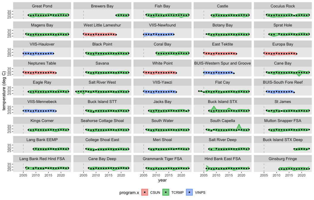
Figure 5 steps back to the annual scale, showing the yearly mean at every site with a standard-deviation range and the min-to-max ribbon, again colored by program.

Show code
ggplot(tempDat_yearly,
       aes(
         x = year,
         y = meantemp,
         color = program.x,
         fill = program.x
       )) +
  # geom_line() +
  geom_ribbon(aes(ymax = maxtemp, ymin = mintemp), alpha = 0.5) +
  geom_point(color = "black", size = 1) +
  geom_linerange(
    aes(ymax = meantemp + sdtemp, ymin = meantemp - sdtemp),
    alpha = 1,
    color = "black",
    linewidth = 0.5
  ) +
  facet_wrap(~ site, nrow = 9, ncol = 5) +
  theme(legend.position = "NULL") +
  ylab("temperature (deg C)") +
  scale_y_continuous(expand = c(0, 0)) +
  geom_vline(
    xintercept = 2005,
    color = "gray50",
    alpha = 0.5,
    lty = "dashed"
  ) +
  # theme_classic() +
  theme(strip.text = element_text(size = 10)) +
  theme(legend.position = "bottom") +
  theme(panel.grid.major = element_blank(),
        panel.grid.minor = element_blank())
Sec 4.5 Figure 5: Yearly mean temperatures at each site (black points, ± standard deviation), with the annual minimum-to-maximum range shown as a ribbon colored by monitoring program (TCRMP, VINPS, CSUN). Sites are ordered shallow to deep. CSUN temperatures are borrowed from the VINPS Yawzi and Tektite loggers. The dashed line marks the 2005 bleaching event.

The interactive companion in Figure 6 superimposes all sites so annual records can be compared directly through the legend.

Show code
p <-
  ggplot(tempDat_yearly,
         aes(
           x = year,
           y = meantemp,
           color = site,
           fill = site
         )) +
  # geom_line() +
  geom_point() +
  geom_linerange(
    aes(ymax = meantemp + sdtemp, ymin = meantemp - sdtemp),
    alpha = 1,
    linewidth = 0.5
  ) +
  ylab("temperature (deg C)") +
  scale_y_continuous(expand = c(0, 0)) +
  geom_ribbon(aes(ymax = maxtemp, ymin = mintemp), alpha = 0.2) +
  geom_vline(
    xintercept = 2005,
    color = "gray50",
    alpha = 0.5,
    lty = "dashed"
  ) +
  # theme_classic() +
  theme(strip.text = element_text(size = 10)) +
  theme(legend.position = "bottom") +
  theme(panel.grid.major = element_blank(),
        panel.grid.minor = element_blank())
# facet_wrap(~ site, nrow = 7, ncol=5) +
# theme(legend.position = "NULL")

ggplotly(p)
Sec 4.5 Figure 6: Interactive companion to Figure 5: yearly mean temperatures colored by site, with all sites superimposed in one panel. Use the legend to compare sites.

Interactive dashboard

Explore the full annual temperature dataset. The plot shows mean annual temperature through time for each site; the table is the complete per-site annual series, searchable and filterable by any column.

Downloads

Each product below downloads as a CSV with its metadata sidecar. The three products are the weekly DHW series (with the annual maximum flagged), the monthly temperature summary, and the annual temperature summary.


version 1.0.0 • in-review • data ≤ 2023-12-31

References

Gove, Jamison M., Gareth J. Williams, Joey Lecky, Eric Brown, Eric Conklin, Chelsie Counsell, Gerald Davis, et al. 2023. “Coral Reefs Benefit from Reduced Landsea Impacts Under Ocean Warming.” Nature, August. https://doi.org/10.1038/s41586-023-06394-w.
Smith, Tyler B., Joanna Gyory, Marilyn E. Brandt, William J. Miller, Jonathan Jossart, and Richard S. Nemeth. 2016. “Caribbean Mesophotic Coral Ecosystems Are Unlikely Climate Change Refugia.” Global Change Biology 22 (8): 2756–65. https://doi.org/10.1111/gcb.13175.

Footnotes

  1. “Daily temperatures were used to categorize days as hot (> 29.3°C) or cold (≤ 26.0°C), with hot days exceeding the coral bleaching threshold for St. John (http://coralreefwatch.noaa.gov/satellite), and ‘cold days’ less than or equal to the lower 12th percentile of daily seawater temperatures in Great Lameshur Bay between 1989-2005 (Edmunds 2006)… Seawater temperature was recorded every 15-30 min using a Ryan Industries thermistor (± 0.3°C accuracy) at 11-m depth from January 1989 to April 1997, and from November 1997 to August 1999; an Optic Stowaway logger (± 0.2°C accuracy) at 9-m depth from May 1997 to October 1997, and from August 1999 to August 2001; and a Hobo Aquapro logger (± 0.2°C accuracy) at 9-m depth from August 2001 to August 2011. Temperatures were averaged by day and month and used to calculate annual mean and range using monthly mean temperatures. Daily temperatures were used to categorize days as hot (> 29.3°C) or cold (≤ 26.0°C), with hot days exceeding the coral bleaching threshold for St. John (http://coralreefwatch.noaa.gov/satellite), and ‘cold days’ less than or equal to the lower 12th percentile of daily seawater temperatures in Great Lameshur Bay between 1989-2005 (Edmunds 2006). This dataset includes data starting in July 1999.” RRSdata/data_CSUN/CSUN_temperature_YawziTektite_metadata.txt↩︎